Challenge
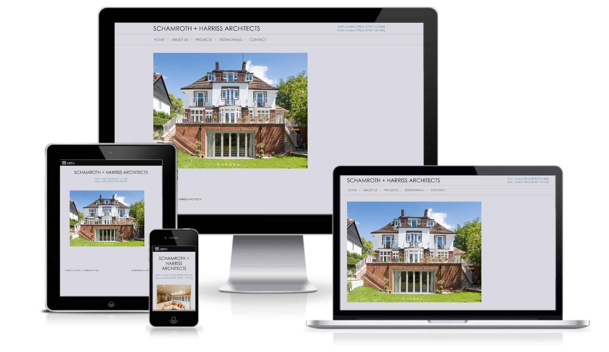
Schamroth + Harriss, a London firm of architects specialising in residential buildings, needed to update its existing website to provide a platform to showcase its work via extensive image galleries. The new content managed site would need to be offer a seamless user experience across all devices, showing off the galleries optimally on smartphones, tablets, and desktop computers.
Solution
PENNInk Productions proposed a specification for a complete bespoke website design and development solution, combining responsive website design and development incorporating numerous picture galleries to highlight the high quality designs that Schamroth + Harriss produce.
Services
- Bespoke website design and development including:
- Responsive design for desktop, tablet, and smartphone
- Highly optimised for fast performance
- Easily editable and extensive, fully responsive image galleries