
1. Don’t use fancy fonts
Unfortunately, with literally thousands of fonts available, it’s a fact that most of them are simply awful. You should certainly avoid any typeface that is made to look handwritten or like a script. Not every fancy font is truly a no-go, but if you’re starting out with a prospective web design, don’t complicate matters by making the wrong font choice. Always think about readability and accessibility.
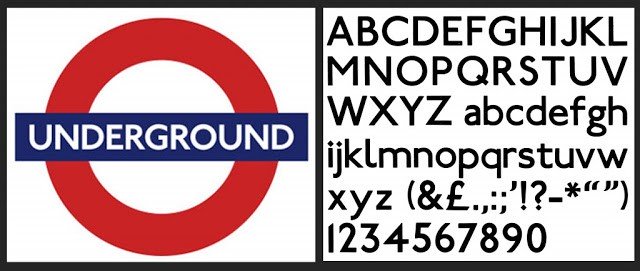
2. Keep font choices simple
As there are so many unsuitable typefaces available, don’t complicate matters by picking the wrong ones. Stick to a few simple fonts and focus on which typefaces are good for smaller screen sizes, which typefaces are good for larger sizes (or for print), and what moods typefaces convey.
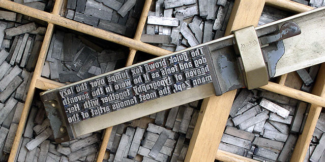
3. Stick to 8-15 words on a line
Widescreen monitors and the responsive design trend have tempted many people into making blocks of text far too wide. You should never allow blocks of text of more than 12-15 words per line, nor let them be shorter than about 8 words per line.

4. Use only one font
You can definitely have a great design – and even enrich a design – by using more than one typeface. However, if you’re just just starting out looking at a new design or a redesign, don’t get distracted. You’ll learn much, much more about what makes a good design if you just pick one good typeface (maximum two) that is right for your project, and instead worry about size changes, alignment, and white space (more on this below in No. 9).
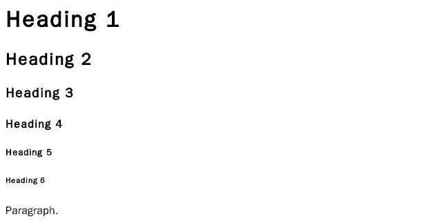
5. Don’t mess around with font sizes
If one of the font sizes in the scale isn’t really achieving the effect you want, there are plenty of other things you can do: use bold or italics, use all-caps (for titling and metadata), or even use a different colour. Stick with the established font sizes for headings and body text and worry about something else.
6. Never justify type
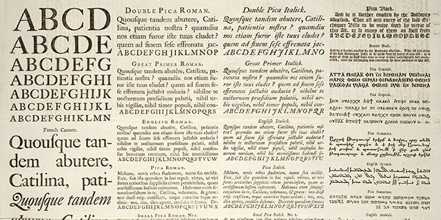
Justified type aligns a body of text to both left and right edges, spreading words across the available space. Good-looking justified type may be achieved in print with quality desktop publishing software, providing you really know your typography. On the web, it’s virtually impossible to do properly. Blocks of type need to be evenly textured. Justifying them just makes unsightly gaps that interrupt the flow of reading. Please don’t sacrifice your content for the false satisfaction of having a crisp edge to your blocks of type.
7. Minimise ornamentation, textures, and effects
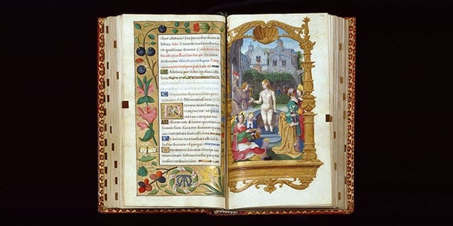
Avoid ornamentation (horizontal and vertical rule lines, text blocks, gradients, textures) as much as possible. Simplify and concern yourself with all of the other details (such as those in No. 9), then perhaps start adding a couple of things in where needed.
8. Choose one colour
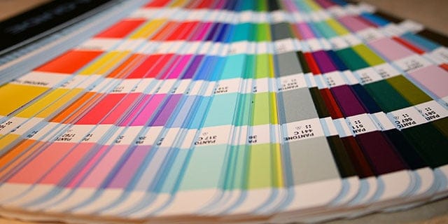
Look carefully at the brands you engage with: John Lewis, O2, Asda, easyJet, Coca Cola, Facebook, Twitter, Apple for example. Each of these brings to mind its own colour. That colour distinguishes each of their products. Choose one colour that is really appropriate for your design. Make everything else shades of that colour or shades of grey. More than anything else, simplify. Once again, concentrate on No. 9 first.
9. Focus more on the “invisible” rather than the “visible”
All of these simple rules are meant to help you simplify your design decisions so that you can concentrate on the “invisible” things in design. We are so easily distracted by shiny things such as fonts and colours, when the things that really matter in making a design look clean and cohesive – the sizing of elements, the way that they align and relate to each other, and the amount of white space between them – are invisible to us.
10. Keep it simple
Above all else, remember to keep things simple. The best designs have remarkably little to them and yet are fully functional and aesthetically pleasing. By keeping your design easy on the eye without any annoying distractions that make the user think too hard, you will be on the way to a successful design.

Edward Solomon has over 30 years’ experience in project management, technical education, computer networking, web design and development and is a Digital Business Consultant for PENNInk Productions Ltd.