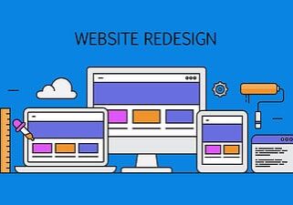


In case you haven’t already heard us saying so, responsive web design (RWD) is A Big Deal. We’ve talked about it, as have all the big names in marketing, and it turns out that it might be even more important than anyone thought.
As the benefits of keeping your website mobile-friendly outweigh the cost of not doing so (and even more disadvantages to non-responsive design continue to present themselves), RWD is deserving of a place near the top of your list of priorities.
Responsive web design deserves a place near the top of your list of priorities. Share on XThe growing proof
There is a growing body of evidence that undoubtedly shows how RWD is one of the important factors that could quite literally make or break your business. Depending on your audience and industry, mobile users could account for up to 70% of traffic. Considering regular content consumption, over 2 billion users are expected to be surfing the web using a smartphone or tablet by 2017 – just a year and a half away. The typical smartphone user checks the device an average of 150 times per day, which potentially represents 150 opportunities for you to break through and convert a prospect to a customer.
Google announced earlier this year that mobile searches now exceed computer-based searches, stating specifically that “more Google searches take place on mobile devices than on computers in 10 countries including the US and Japan.”
The list of compelling statistics just keeps on going. If you’re not convinced yet, just take a look at the cost of ignoring RWD.
The cost of unresponsive design
By now, you will have heard the case for RWD. Check out what you’re facing by ignoring RWD.
Search ranking penalty
Early in 2015, Google announced that RWD would become a notable factor in rankings. In April, the respective algorithm change was implemented, meaning you’ll probably begin to see your search engine rankings drop if you fail to adapt your website design and user experience for mobile users.
Frustrated users
Web users are finicky, especially when looking to make a purchase. Research reveals that you have a window of 7 seconds to capture the user’s attention before he or she goes away. Worse still, 73% of mobile web users say they’ve come across a site that took too long to load on their smartphone or tablet.
Reduced credibility
First impressions matter, of that there is no question. If your site isn’t set up to give the best impression on all platforms, you’re really setting yourself up for disaster. Each and every user should receive an impeccable UX (user experience) and UI (user interface) experience the very first time they visit your site, irrespective which device they may be using.
You have a few options when it comes to bringing your site up to speed with modern RWD standards. Share on XGetting up to speed
Have we sold you on the benefit (read: necessity) of implementing RWD? If you’re still working with a non-responsive design, you may be starting to feel a little nervous at this point, but don’t be discouraged. You have a few options when it comes to bringing your site up to speed with modern RWD standards.
Switch to a responsive theme
If your website CMS (content management system) is WordPress, Joomla! or something similar, making the switch to a responsive theme — and hiring a design firm to make the transition as smooth as possible — is a cost-effective option. Professionally designed themes are stable and include all the latest design trends even with minimal customisation.
Build custom from scratch
Regardless of your situation, this option is easily the most expensive. However, it’s also the one option to provide the highest level of customisation and quality with a completely bespoke design. A larger, more established business with a heavy reliance on revenue generated from its web presence simply cannot do any wrong by creating a new responsive website from the ground up, no matter the cost.
Adapt an existing site
In some cases, it is possible to convert an existing website to be mobile responsive. If you have a strong brand attachment to your current site, a lot of prebuilt systems, or other assets that might make a redesign difficult, this approach may be your best option.
The potential return
Return on investment (ROI) is always the metric we would use to quantify and measure the success of implementing a new design. Seeing the increase in demand for RWD, you cannot but acknowledge the tremendous return you’ll be receiving on your investment from a new mobile-friendly site. From preventing customers from dropping off your site to keeping your existing customer base happy, there’s no denying the value of a clean, effective responsive design.

Edward Solomon has over 30 years’ experience in project management, technical education, computer networking, web design and development and is a Digital Business Consultant for PENNInk Productions Ltd.